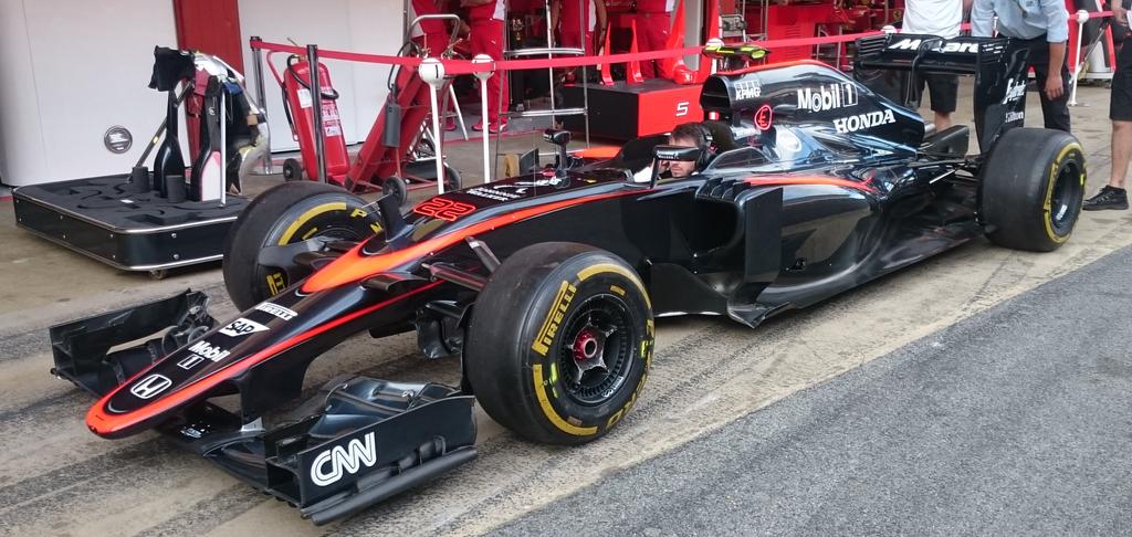


#aerogollumturbof1 wrote: YOU SHALL NOT......STALLLLL!!!
#aerogollumturbof1 wrote: YOU SHALL NOT......STALLLLL!!!

Sevach wrote:


The only brand identity Mclaren really have as a company is that they're sterile. Painting the cars nondescript white would have better represented Mclaren as a company than whatever this livery is.turbof1 wrote:It doesn't help that mclaren partly wants to tear on that heritage. Until now they have not realmy shown to where they want their image move to, or even if it moves at all.
Don't get me wrong: I personally don't really have any nostalgic urges towards the 'iconic' red striped white livery. As far as mclaren go, they don't really have a livery that you could historically call "pure mclaren". They do have their crescent orange symbol, which is what defines mclaren, and which has been on the car a very long time now, but that's the only thing that makes mclaren "mclaren".


Just have the same tought about the second swoosh. anyone with great photoshop skills here to remove it? i would like to see how the car would look like without the second swoosh.Jef Patat wrote:I like it as well, but without the second swoosh it would be even better. Certainly from a lower front viewpoint it seems like a nose on top of the nose. It gives me a feeling of double vision/
https://scontent-fra.xx.fbcdn.net/hphot ... e=55C6556C