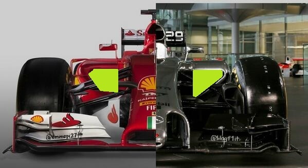
Cuky wrote:Maybe I am a bit subjective as I am a Ferrari fan, but I like it. It is strange, yes, but that doesn't make it ugly. Over the past few years they always tried to copy others in their designs (rear pull-rod, coanda exhaust, high flat nose,...) so I am happy that hey finally came up with something on their own. Last time one team did that (RB) they went on to win 4 straight titles with just a few refinements each year. And last time Ferrari went on with new different things they won 6 Constructors and 5 drivers titles in a row
I find your post peculiar. Specifically that you wouldn't call it ugly.
I believe that car has a decent claim to win, if not definitely come in the top 3 of a real poll of most ugliest F1 cars in the history of Grand Prix racing.
That's top 3 of ugliest -ever-.
Honestly, if you don't find that car ugly, is there anything that you would consider ugly at all?
F1 car width now 2.0m (same as 1993-1997). Lets go crazy and bring the 2.2m cars back (<1992).


