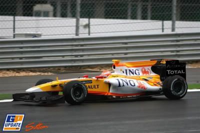
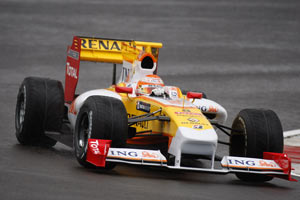
This would be drastically better that way!
Just put the "TOTAL" inscription in red on the black wings
(like it is on the 908 proto actually), and everybody should be happy.
Actually a Renault F1 should never be other than yellow with black or white skirts & endplates, and some black or white stripes...

Metar wrote:I thought it failed the side-impact tests?
I heard one of the failed test was side-impact, but I'm unsure about the other. It was just an idea that poped in my mind, I guess there's a rational part of my brain that CANNOT accept such a livery/design combo to be planned like that. It has to be an accident of some sorts!


