Same goes for the lack of wing at the back...it all seems a bit retro!?
- Login or Register
No account yet? Sign up
Yes, what is that?Sawtooth-spike wrote:Also anybody else noticed the outlet infront of the rewing, at the back of the engine cover?
Second that.HKS wrote:The livery doesn't at all suit the car

And that.Manchild wrote:Ugly livery makes it look ugly but in fact it is quite interesting car.
Tomba wrote
What strikes me about this car is the thickness of the nose. It kind of reminds me to the Arrows A21 by Agathangelou....


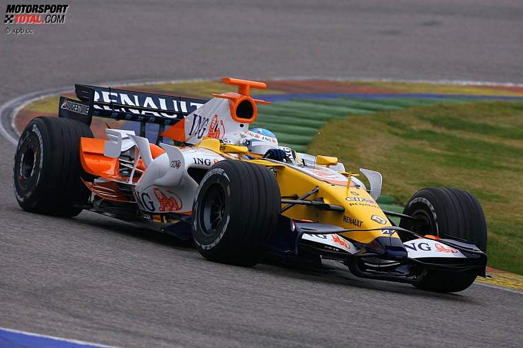
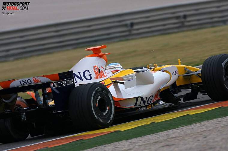



I agree manchild, I was thinking this myself, but I had no picture to justify my thoughts. I think though your picture above kinda confirms our suspisions. Have a look closely where the front wing passes under the nose - it appears that there is a notch, shaped a little bit like the letter "U", but look at the small portion we can see under the nose, it looks like the trailing edge of the wing rises up into the nose, now I see no reason why it would meet the nose, but maybe it rises up into a cavity of some sort.manchild wrote:What if only vertical sides and top are as it seams while in fact nose and chassis bottom are shaped as a diffuser? Ok, that would make it two-keel car than. I bet nose isn't flat at its bottom.