Caption Competition

Post here all non technical related topics about Formula One. This includes race results, discussions, testing analysis etc. TV coverage and other personal questions should be in Off topic chat.
marmer
marmer
1
Joined: 21 Apr 2017, 06:48

Re: Caption Competition

Post

There is an extended version of the Kimi video on YouTube where he shoves his wife out if the way to go signs stuff for his fans she doesn't look impressed lol

User avatar
Morteza
2308
Joined: 10 Feb 2010, 18:23
Location: Bushehr, Iran

Re: Caption Competition

Post

Image
"A fool thinks himself to be wise, but a wise man knows himself to be a fool."~William Shakespeare

User avatar
Morteza
2308
Joined: 10 Feb 2010, 18:23
Location: Bushehr, Iran

Re: Caption Competition

Post

Only in Japan :D
Image
"A fool thinks himself to be wise, but a wise man knows himself to be a fool."~William Shakespeare

User avatar
Morteza
2308
Joined: 10 Feb 2010, 18:23
Location: Bushehr, Iran

Re: Caption Competition

Post

Image
"A fool thinks himself to be wise, but a wise man knows himself to be a fool."~William Shakespeare

marmer
marmer
1
Joined: 21 Apr 2017, 06:48

Re: Caption Competition

Post

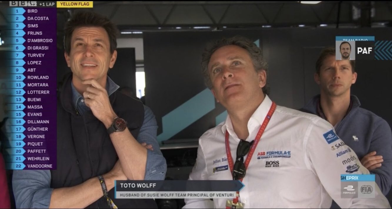
husband of.... while correct is suspect a more correct title would be multiple constructor championship team boss
wesley123
wesley123
204
Joined: 23 Feb 2008, 17:55

Re: Caption Competition

Post

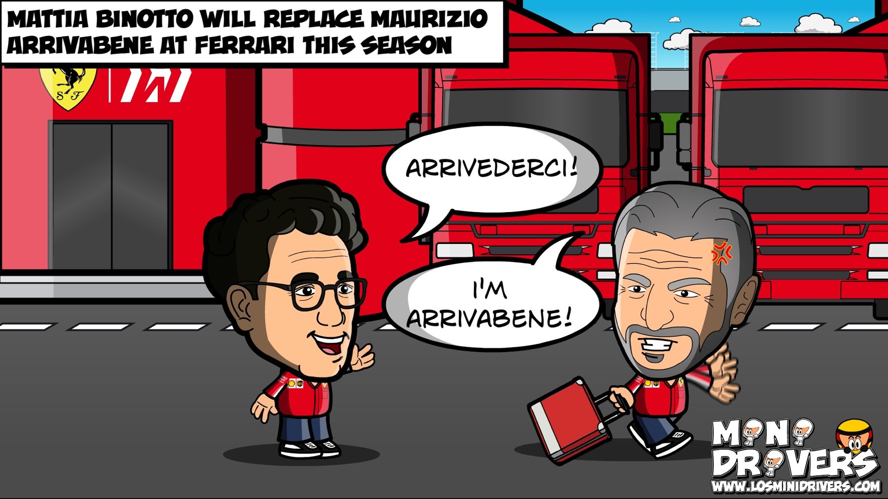
If you thought the bombshell of Arrivibene leaving was big, then you better be prepared for this bombshell that was just spoiled
"Bite my shiny metal ass" - Bender

Manoah2u
Manoah2u
61
Joined: 24 Feb 2013, 14:07

Re: Caption Competition

Post

btw, do you know what 'toto' means in spanish? :P

also, VanDoorne showing as usual why he didn't belong in F1, and why he doesn't belong in Formula E either.
"Explain the ending to F1 in football terms"
"Hamilton was beating Verstappen 7-0, then the ref decided F%$& rules, next goal wins
while also sending off 4 Hamilton players to make it more interesting"

User avatar
turbof1
Moderator
Joined: 19 Jul 2012, 21:36
Location: MountDoom CFD Matrix

Re: Caption Competition

Post

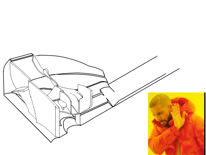
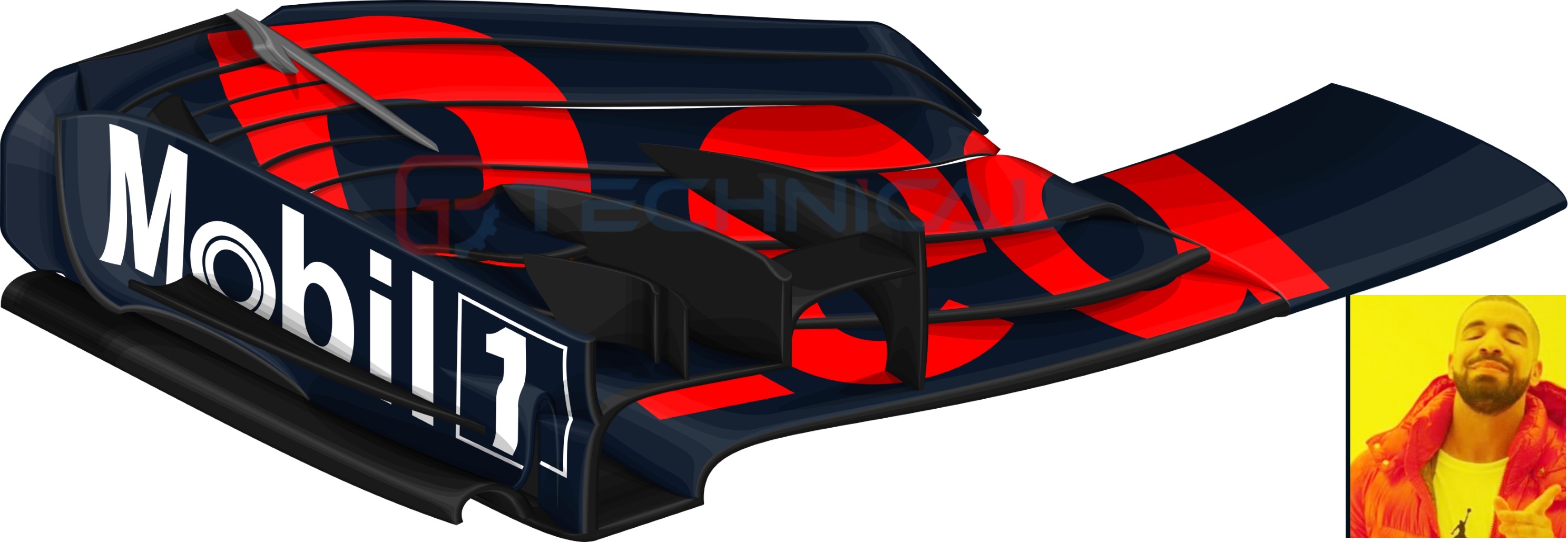
A little poke to myself where I compare my artwork to what it was 5 years and also as a quick teaser for an upcoming article:

Image

Image

We'll be doing a very indepth article on the 2019 front wing, coming up this monday. Stay tuned.
#AeroFrodo

Just_a_fan
Just_a_fan
593
Joined: 31 Jan 2010, 20:37

Re: Caption Competition

Post

The first image is better as it shows things. The second image is pretty, very magazine type stuff, but is less useful as it hides the details. Don't go down the "dumb media" route, please.

If you are more fortunate than others, build a larger table not a taller fence.

User avatar
djos
113
Joined: 19 May 2006, 06:09
Location: Melbourne, Australia

Re: Caption Competition

Post

Just_a_fan wrote:
02 Feb 2019, 22:43
The first image is better as it shows things. The second image is pretty, very magazine type stuff, but is less useful as it hides the details. Don't go down the "dumb media" route, please.
Motion seconded, it's really hard to make out detail in the rendered image, unless you zoom right in with your phone.
"In downforce we trust"

User avatar
turbof1
Moderator
Joined: 19 Jul 2012, 21:36
Location: MountDoom CFD Matrix

Re: Caption Competition

Post

Just_a_fan wrote:
02 Feb 2019, 22:43
The first image is better as it shows things. The second image is pretty, very magazine type stuff, but is less useful as it hides the details. Don't go down the "dumb media" route, please.
Oh you think it hides details? Well then, I'll guess I'll just have to do this:

Image

Try to find that in your average magazine 8)

(for the record, these illustrations are not rendered...)
#AeroFrodo

Just_a_fan
Just_a_fan
593
Joined: 31 Jan 2010, 20:37

Re: Caption Competition

Post

All very pretty but still not as useful as the original line drawings.
If you are more fortunate than others, build a larger table not a taller fence.

Capharol
Capharol
21
Joined: 04 Nov 2018, 17:06

Re: Caption Competition

Post

turbof1 wrote:
02 Feb 2019, 23:36
Just_a_fan wrote:
02 Feb 2019, 22:43
The first image is better as it shows things. The second image is pretty, very magazine type stuff, but is less useful as it hides the details. Don't go down the "dumb media" route, please.
Oh you think it hides details? Well then, I'll guess I'll just have to do this:

http://u.cubeupload.com/turbof1/RBShadi ... ssembl.png

Try to find that in your average magazine 8)

(for the record, these illustrations are not rendered...)
I Like.... =D>

User avatar
turbof1
Moderator
Joined: 19 Jul 2012, 21:36
Location: MountDoom CFD Matrix

Re: Caption Competition

Post

Just_a_fan wrote:
02 Feb 2019, 23:43
All very pretty but still not as useful as the original line drawings.
Oh I don't question the black lined/white surface images are clearer in most cases, I just don't agree they hold less detail (they hold more, but you have to zoom in for it). The article will mostly use those black lined drawings, with the exception of a few ones where it will be zoomed in completely to specific spot so you will see the detail well enough:
Image

But mostly it will be line drawings. Infact, the no-line drawings are fully build on the former. Just see the shaded no-line versions as artwork. And yes, they will be used from time to time, but always keeping in mind the image shown should be clear, just like the one above.
#AeroFrodo

User avatar
Morteza
2308
Joined: 10 Feb 2010, 18:23
Location: Bushehr, Iran

Re: Caption Competition

Post

"A fool thinks himself to be wise, but a wise man knows himself to be a fool."~William Shakespeare