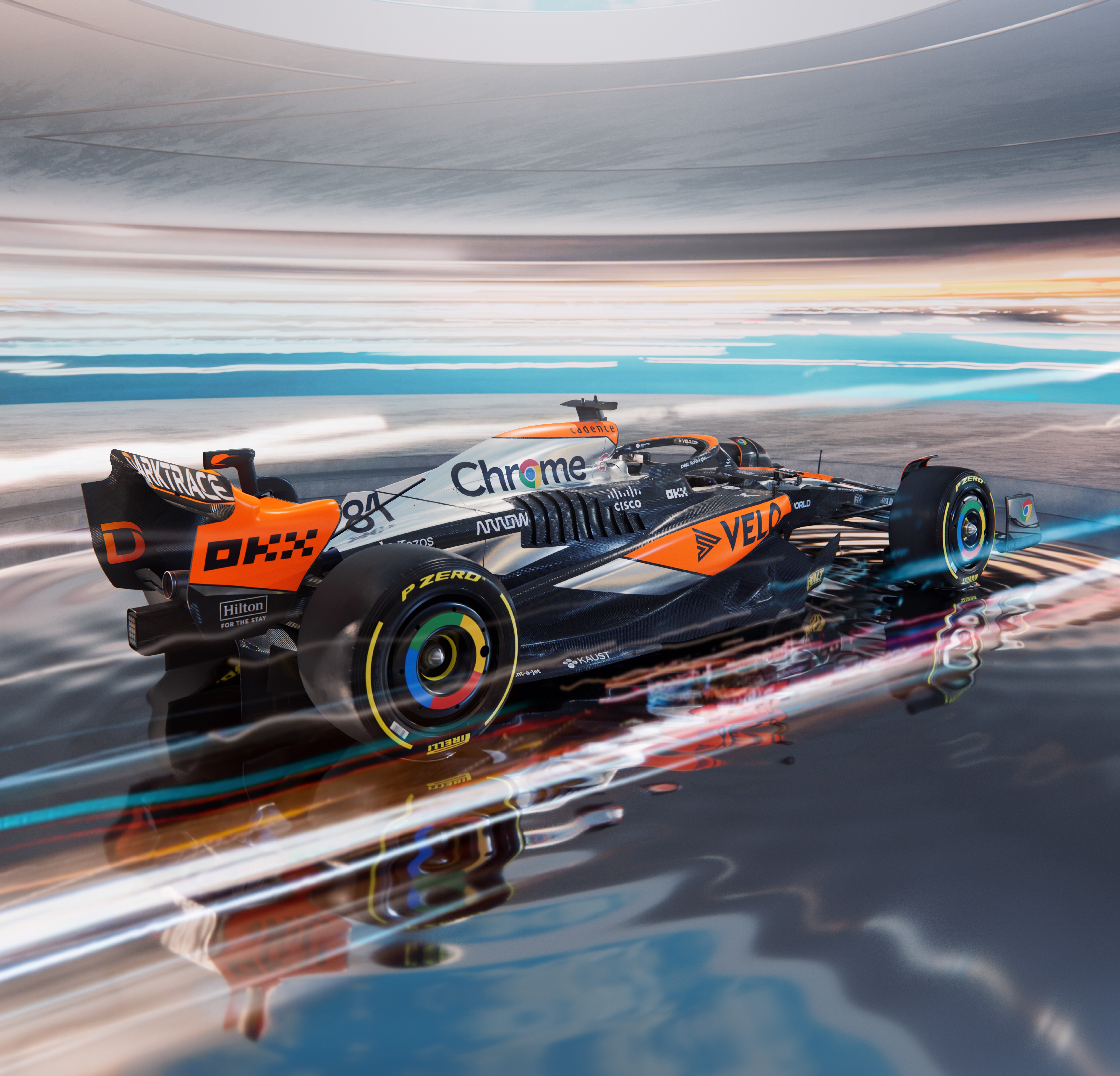
An improvement but that's not saying much. Need to gardening leave their "livery" crew. McLaren people, DM me, I'll make something that looks better at 1/100th the cost. I mean if all you had was say Microsoft Powerpoint to produce the graphics, I would say, "not bad."
West black/silver was classic. Vodafone chrome/red-orange was maybe the greatest livery of all time. 80s white/red is definitive F1 car.
They keep wanting to throw back to orange but no one has any connection to that. All the evocative McLaren memories are from those three color schemes mentioned. Basic stuff, what are you guys doing, honestly.
- Login or Register
No account yet? Sign up


