2014 Design

Here are our CFD links and discussions about aerodynamics, suspension, driver safety and tyres. Please stick to F1 on this forum.
User avatar
turbof1
Moderator
Joined: 19 Jul 2012, 21:36
Location: MountDoom CFD Matrix

Re: 2014 Design

Post

TheWPTFormula wrote: This is either a very good idea or we have missed something integral within the rules. I'll have a look at the vanity panel regulations.
Yes indeed. I personally think it's an extreme long walk with the rules, but legal within interpretation (setting vanity panel rules aside, which I can't get to find)! It'll probably be beaten to death with Technical Clarifications, but I find it a good thinking excercise :P.

And you could always substitute vanity panel with more nose. It only has to be continual looking from the side, so there is still some room left for improvement to pass the crash test.
Last edited by turbof1 on 31 Dec 2013, 14:38, edited 1 time in total.
#AeroFrodo

astracrazy
astracrazy
31
Joined: 04 Mar 2009, 16:04

Re: 2014 Design

Post

theWPTformula wrote:
Tim.Wright wrote:Doesn't the vanity panel have a specified (light) layup? I doubt it would be strong enough to pass the front wing deflection tests or even hold the front wing.
Was just thinking the same thing. I doubt it would pass the crash tests anyway, even if the design is legal.
these

the design just might be legal, but impossible because of the above

edit: but what if you adjusted your design and moved the pillar(s) more central?

User avatar
turbof1
Moderator
Joined: 19 Jul 2012, 21:36
Location: MountDoom CFD Matrix

Re: 2014 Design

Post

Second iteration:
Image

Basicilly, replaced some vanity panel surface with nose surface. Also, in response to Tim Wright, I changed how I integrated the pylons: now the real ones are 'glued" to the vanity/nose pylons and both pylons are attached to the actual nose. Nose pylons are also slightly thicker. The vanity panel stays there to keep symmetry on both sides of the bigger pylons.

So both more top nose surface and nose pylon surface, plus actual pylons in symmetry attached to the underside of the nose. Gives a better chance to pass the crash and deflection tests, but is a slightly more compromise in terms of volume underneath the car.

If somebody now comes with an explicit rule that assymetric noses are forbidden, I am going to cry.

EDIT: "Sabretooth" nose with pylons behind nose/panel.
Image
#AeroFrodo

Manoah2u
Manoah2u
61
Joined: 24 Feb 2013, 14:07

Re: 2014 Design

Post

that's interesting =D>
"Explain the ending to F1 in football terms"
"Hamilton was beating Verstappen 7-0, then the ref decided F%$& rules, next goal wins
while also sending off 4 Hamilton players to make it more interesting"

Matt Somers
Matt Somers
179
Joined: 19 Mar 2009, 11:33

Re: 2014 Design

Post

@WPTFormula asked me to stop by and have a look at this and I have to applaud the thinking @turbof1, I must say I did have similar thoughts when I first drew a Walrus style nose. The regulations do seemingly allow you to do as you have described but I do see a couple of issues. Firstly the nose tip that's adjoined to one side of the Y250 would create an inconsistent airflow pattern to that of the other side (unless of course you designed the nose tip to fit inside the pylon ;) )
One of the other issues is the crash test which will be done without the pylons, meaning not only would it have to pass the test (not an insurmountable task but the asymmetrical design would make for an interesting energy displacement) but it would also show the hand of the teams design to the FIA. Although as we all know there is no such thing as the spirit of the rules, this certainly treads that line very closely. I'm quite sure a clarification would quickly ensue from Charlie if anyone did try to run such a design as it would mean a complete rethink/redesign from everyone...
Catch me on Twitter https://twitter.com/SomersF1 or the blog http://www.SomersF1.co.uk
I tweet tech images for Sutton Images

User avatar
turbof1
Moderator
Joined: 19 Jul 2012, 21:36
Location: MountDoom CFD Matrix

Re: 2014 Design

Post

Matt Somers wrote:@WPTFormula asked me to stop by and have a look at this and I have to applaud the thinking @turbof1, I must say I did have similar thoughts when I first drew a Walrus style nose.
Yeah thanks! I was looking at a different design (the one posted in the ferrari speculation topic), where they did something odd with the nose. I was thinking about how that could have been made legal, and then suddenly the assymetrical idea jumped on me. Then I took a look on the rule and suprisingly nothing is widstanding this.
Firstly the nose tip that's adjoined to one side of the Y250 would create an inconsistent airflow pattern to that of the other side (unless of course you designed the nose tip to fit inside the pylon ;) )
I was thinking about using the vanity panel to mirror the nose to the other side. And yes, you could place the pylons behind the "teeth" and use them to smoothen out sharp edges.
I'm quite sure a clarification would quickly ensue from Charlie if anyone did try to run such a design as it would mean a complete rethink/redesign from everyone...
Yes, unfortunaly. It's quite an unsafe design; charley, and if not him the FIA, would do anything to get rid of it. I do feel though that other extreme designs like the "snowplough" nose will get the same fate.

Anyway, as a theoritical excercise I really enjoyed this.
#AeroFrodo

Matt Somers
Matt Somers
179
Joined: 19 Mar 2009, 11:33

Re: 2014 Design

Post

Had a little thought about this again since my last post and the only real stumbling block (if you could get it through the crash tests and passed the FIA) is that you need to project a surface area of 9000m2 50mm behind the tip, furthermore it must fit into a box between 250mm and 135mm above the reference plane.

This leaves a window of 115mm and to pass the surface area of 9000mm2 will mean a width of 78.26mm wide a little wider than the maximum 25mm wide the pylons can be..
Catch me on Twitter https://twitter.com/SomersF1 or the blog http://www.SomersF1.co.uk
I tweet tech images for Sutton Images

User avatar
turbof1
Moderator
Joined: 19 Jul 2012, 21:36
Location: MountDoom CFD Matrix

Re: 2014 Design

Post

Matt Somers wrote:Had a little thought about this again since my last post and the only real stumbling block (if you could get it through the crash tests and passed the FIA) is that you need to project a surface area of 9000m2 50mm behind the tip, furthermore it must fit into a box between 250mm and 135mm above the reference plane.

This leaves a window of 115mm and to pass the surface area of 9000mm2 will mean a width of 78.26mm wide a little wider than the maximum 25mm wide the pylons can be..
I was aware of the 9000mm² 50mm rule, but not of the extra 250mm 135mm box. 53mm extra width isn't helpful, especially not since you try to keep symmetry with the vanity panel and thus also have 53mm penalty on the other side. My gut says that this solution still allows more air underneath the nose then the "finger nose" design though.

The 50mm is in accordance with the reference plane right? It would atleast allow the front edge of the nose-pylon to be very narrow and then going inwards progressively wider until 50mm back and at 135mm high it is 53mm. It would basicilly just funnel air in.

Are they allowed to tighten back the nose after that point?
#AeroFrodo

Matt Somers
Matt Somers
179
Joined: 19 Mar 2009, 11:33

Re: 2014 Design

Post

They can do what they like post the 9000mm2 area, the pylons maximum width is 25mm but like the RW Endplates you could pinch surface area from them to facilitate the 78.26mm width for that section of nose... Even accounting for pinching say 20mm that still leaves 58.26mm exposed. In the interest of symmetry the vanity panel would also need to match of course giving a surface area of 116.52mm x 115mm of frontal region. However the big plus point would be you could create a Venturi... I'm on my iPhone ATM so I'll draw what I mean tomorrow...
Last edited by Matt Somers on 01 Jan 2014, 13:52, edited 2 times in total.
Catch me on Twitter https://twitter.com/SomersF1 or the blog http://www.SomersF1.co.uk
I tweet tech images for Sutton Images

User avatar
turbof1
Moderator
Joined: 19 Jul 2012, 21:36
Location: MountDoom CFD Matrix

Re: 2014 Design

Post

Matt Somers wrote:They can do what they like post the 9000mm2 area, the pylons maximum width is 25mm but like the RW Endplates you could pinch surface area from them to facilitate the 78.26mm width for that section of nose... Even accounting for pinching say 20mm that still leaves 58.26mm exposed. In the interest of symmetry the vanity panel would also need to match of course giving a surface area of 116.52mm x 115mm of frontal region. However the big plus point would be you could create a Venturi... I'm on my iPhone ATM so I'll draw what I mean tomorrow... Hopefully I'll win the Infiniti competition I won and then I'll pass it under Mr Neweys nose too ;)
I more or less get what you mean. I tried to draw it myself, but it really proves too difficult. I too was thinking about the venturi effect, which could compensate for 116,52mm penalty.

Very lovely conversation =D> . Let me know something when you drew it up; looking very much forward to it.
#AeroFrodo

Matt Somers
Matt Somers
179
Joined: 19 Mar 2009, 11:33

Re: 2014 Design

Post

turbof1 wrote:
Matt Somers wrote:They can do what they like post the 9000mm2 area, the pylons maximum width is 25mm but like the RW Endplates you could pinch surface area from them to facilitate the 78.26mm width for that section of nose... Even accounting for pinching say 20mm that still leaves 58.26mm exposed. In the interest of symmetry the vanity panel would also need to match of course giving a surface area of 116.52mm x 115mm of frontal region. However the big plus point would be you could create a Venturi... I'm on my iPhone ATM so I'll draw what I mean tomorrow... Hopefully I'll win the Infiniti competition I won and then I'll pass it under Mr Neweys nose too ;)
I more or less get what you mean. I tried to draw it myself, but it really proves too difficult. I too was thinking about the venturi effect, which could compensate for 116,52mm penalty.

Very lovely conversation =D> . Let me know something when you drew it up; looking very much forward to it.
I started drawing the 'Sabretooth' nose and suddenly realised perhaps it would be best to check the wording about the vanity panel:

Any bodywork situated above the impact absorbing structure defined by Article 15.4.3 or above the survival cell, and forward of the line B-B, must be of prescribed laminate, details of this laminate may be found in the Appendix to the Technical Regulations.


The key word there is above, the Sabretooth wouldn't work because the vanity panel used to mirror the vertical nose tip can't be at the same height...
Catch me on Twitter https://twitter.com/SomersF1 or the blog http://www.SomersF1.co.uk
I tweet tech images for Sutton Images

avatar
avatar
3
Joined: 13 Mar 2009, 22:01

Re: 2014 Design

Post

I'm liking the asymmetric idea.

No offence to Blanchimont, but the "Drew Peacock nose" in it's initial form looks pretty awful (though attaching the pylons to the Drew Peacock could help aesthetically).

On the asymetric sabre toothed nose:
It does mean asymmetric pylons to hold the wing, so the non nose side would be pretty unconventional as it will be attached to part of the nose much further back.

With regard to safety; surely if it passes, it's either safe, or the crash tests aren't fit for purpose?
I guess side deflection (in an off-center frontal impact) would be its undoing though as the forward section of the nose might miss the impact entirely, leaving the trailing side edge of the nose and the bulkhead to take the force with far less to absorb it...

I get the feeling the FIA were aiming to see the '08 MacLaren as the nose style of choice, but writing regs with a picture in mind never really works out.

User avatar
turbof1
Moderator
Joined: 19 Jul 2012, 21:36
Location: MountDoom CFD Matrix

Re: 2014 Design

Post

Matt Somers wrote:
turbof1 wrote:
Matt Somers wrote:They can do what they like post the 9000mm2 area, the pylons maximum width is 25mm but like the RW Endplates you could pinch surface area from them to facilitate the 78.26mm width for that section of nose... Even accounting for pinching say 20mm that still leaves 58.26mm exposed. In the interest of symmetry the vanity panel would also need to match of course giving a surface area of 116.52mm x 115mm of frontal region. However the big plus point would be you could create a Venturi... I'm on my iPhone ATM so I'll draw what I mean tomorrow... Hopefully I'll win the Infiniti competition I won and then I'll pass it under Mr Neweys nose too ;)
I more or less get what you mean. I tried to draw it myself, but it really proves too difficult. I too was thinking about the venturi effect, which could compensate for 116,52mm penalty.

Very lovely conversation =D> . Let me know something when you drew it up; looking very much forward to it.
I started drawing the 'Sabretooth' nose and suddenly realised perhaps it would be best to check the wording about the vanity panel:

Any bodywork situated above the impact absorbing structure defined by Article 15.4.3 or above the survival cell, and forward of the line B-B, must be of prescribed laminate, details of this laminate may be found in the Appendix to the Technical Regulations.


The key word there is above, the Sabretooth wouldn't work because the vanity panel used to mirror the vertical nose tip can't be at the same height...
Hmmm, I am not 100% sure if you have to take that literal. It says that the bodywork above must be of laminate, but does not state anything of below, aside or in front of it. Scarbs drew a possible nose design where he effectively encased a very thin nose in the laminate, also on the sides of it. Last years there were rumors, but never confirmed I believe, that Ferrari used the vanity panel to extend their nose, so in front of it. Of course not what the FIA intended, but teams did take a walk with several interpretations of that line.

I also asked Scarbs about this. He said the design would fit within the rules themselves, but mentioned that Sauber had posed a similar question last year to the FIA. They inmediately beated it to death with a Technical Directive.
#AeroFrodo

avatar
avatar
3
Joined: 13 Mar 2009, 22:01

Re: 2014 Design

Post

Matt Somers wrote: I started drawing the 'Sabretooth' nose and suddenly realised perhaps it would be best to check the wording about the vanity panel:

Any bodywork situated above the impact absorbing structure defined by Article 15.4.3 or above the survival cell, and forward of the line B-B, must be of prescribed laminate, details of this laminate may be found in the Appendix to the Technical Regulations.


The key word there is above, the Sabretooth wouldn't work because the vanity panel used to mirror the vertical nose tip can't be at the same height...
I was assuming something like this (pretty bad, done on a tablet) sketch anyway:
Image

Obviously use curves rather than straight lines and shape the teeth off etc.

Or is the vanity panel subject to some single cross-section restrictions?

Matt Somers
Matt Somers
179
Joined: 19 Mar 2009, 11:33

Re: 2014 Design

Post

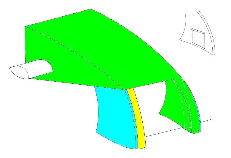
Ok decided to draw it anyway for visualization purposes

Image

So the nose structure is defined in green with the lower tooth section extending to meet with the front of the pylon (Pylons shown in aqua) on the right (Pylon is 25mm and the frontal section of the tooth is 58.26mm) this means that at 50mm rear of the tip the Nose section is inserted into the pylon by 20mm to overcome the 9000mm2 in the regulations. (Think of a Dovetail joint etc in woodworking and then have a look at the quick sketch in the top right hand corner of how you can rob surface area from the Pylon)

The other side of the nose (tooth) cannot project into the same area/space as otherwise you have a conflict with the wording of the regulations (centre). Therefore to create symmetry for aero the yellow section depicts the vanity panel.

I still think the crash test is the largest downfall factor in this design, let alone getting around the wording in the regulations that would almost certainly see a clarification issued (if there hasn't been already).

*Obviously bear in mind I haven't gone to the effort of scaling things in the image
Catch me on Twitter https://twitter.com/SomersF1 or the blog http://www.SomersF1.co.uk
I tweet tech images for Sutton Images