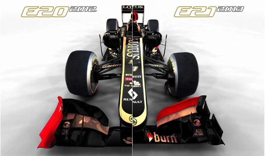
Nostalgia is pointless. Their they're own team wanting to write their own history. Maybe some day a team will want to copy the red black and gold of the 2013 car.
I guess the red makes it easier to read the sponsors adds from afar. The black and gold was in fact a bit subdued, it made you look on the car as a whole instead of noticing what was written in the gold writing.


